Sunday, August 16, 2009

Blue Tablecloth

This is 9" x 12" on reverse beveled foamboard. I glued down some cut-open bouquet garni bags and then sealed the whole surface (including down the bevels all the way to the edges) with clear Colourfix primer.

The gouache underpanting is below on the left and a work-in-progress pic is on the right.

Questions/Issues:
-- Is it too unbalanced with the underneath of the table on the lower left and nothing to balance that weight on the right?
-- Would another pear, lying on its side, partially behind the right-most pear do the job?
-- Or does the busy texture of the cheesecloth on the upper right balance it enough?
-- Or should I just give up the bevels and crop it?
-- The pans don't seem to do well on the cheesecloth. The pastels sticks, on the other hand, do wonderfully. This needed one very thick spray of SpectraFix in order to move forward with pans. Is there a better primer mixture that I can use to prime the cheesecloth? Or should I just stick with the sticks.
-- Does this need a rear (back) edge for the table, a "line" where the tabletop turns into the back wall? Or is there enough depth as it is?


Framed, below:


Friday, August 14, 2009

Lava-flow of Clichés

This is just a scribble test sketch on the new (to me) PastelMat paper from Clairefontaine, the fancy dancy Euro paper manufacturer, paper color "dark gray". It is like shaved-down velour paper. Interesting, but I think I will survive it.

"Clairefontaine's fine art paper is manufactured at the Schut paper mill in the Netherlands. Est. 1618."
I like that part, though this stuff is no doubt subcontracted out somewhere else. Like maybe, Arkansas.

I like the way the paper works with the pans. It also seems to take the water and alcohol washes just fine. Needs to be glued to board. We'll see!

++++++++++++++++++++++
BONUS musical Quote: The late critic and music scholar Michael Steinberg, "dismissing" Leonard Bernstein's Symphony No 3 in 1964, in the Boston Globe as "a lava-flow of clichés." Whoa. More on Steinberg.
Here is the full review. Ravishingly excellent.

Wednesday, August 12, 2009

Butte with Cheesecloth, rev.

This is 9" x 12" on one of my new "reverse beveled" supports, this one the archival foamboard*. There is a rectangle of cheesecloth glued in the center and I do like that look a lot. Why? I don't know. I think because it is distracting.

(* Foamboard support is a little bit on the flimsy side -- plus it bends too easily. Even though it's thicker than the beveled illustration board, I am not too sure about it. Feels cheesey.)

Tuesday, August 11, 2009

Shhh . . . .


++++++++++++++++++++++
BONUS oenological Quote: "Wine is sunlight, held together by water." Galileo Galilei
++++++++++++++++++++++
BONUS oenological Video: Bottle Shock trailer

Monday, August 10, 2009

Łigaii Tó

This is a view of Lava Falls taken in 1872 during the Second Powell Expedition. Lava Falls usually drops about 13 feet in about 1,000 feet of river today. I wonder what is was like in 1872.


Album.

Saturday, August 8, 2009

Hand to mouth

This message was recently posted in one of the forums that I look at: " . . so tell me what y'all do or get or whatever with your sketches. :D ~Kirby"

What I do.
Kirby, I sketch for two reasons. First, I sketch because I just enjoy the heck out of it. It's fun. My everyday sketching has no direct or immediate bearing on my pastel paintings. Except that I think sketching is sharpening my eye and helping me to see the world around me more clearly.

Second, when working plein air, I use the sketch phase to slow down and work out the composition. I have discovered that I get too excited. If I just plunge right in and start painting when I am working plein air, I inevitably end up with a lame composition. I find it's MUCH better to devote time to playing with different viewpoints, to working out the composition (and the value pattern) in the sketchbook FIRST. It's time well spent for me. Besides, the fun for me is being out there and seeing and messing around. Plus sketching to find the best composition is a good visual warm-up exercise.

What someone else does. NOW, here is an opposing strategem from a "professional artist" named Robert Genn, who does NOT sketch. His time spent in sketching is time taken away from cranking out paintings that he can sell. Or as he puts it, his decision not to sketch is " . . . somewhat a commercial decision--my effort goes directly to an eventually more collectable [sic] item. . ." He then goes on to justify it with some "artistic considerations" as well.

As you can see from the comments below his posting, rare is the respondent who agrees with him. It's an interesting discussion happening down there.

The distinction between us. The more I listen to these kinds of conversations and follow these kinds of discussions, the more I suspect that there are (very roughly) two kinds of artists. The first group are those that do it for the sheer fun of it. For them, the finished product isn't the point; the process is what is engaging. Those in this group can sometimes can get so caught up in their projects and their processes that they can, quite blithely, turn out mounds of total crap. The dark side of this artist is that he isn't all that interested in acquiring "technical prowess", as measured by standards outside himself.

The other kind of artist is the one that does it in order to produce a painting. (Or a sculpture, or a ceramic pot or a drawing or whatever.) These aren't necessarily always the pros, the crank-it-out folks (like Mr. Robert Genn) who have to sell their work to eat. The amateur version of this artist spends a lot of time talking about 'talent', often as a lament or a complaint. They're delighted when folks say "Wow, our drawing looks just like a photograph!". They are thin skinned and take a critique poorly. They get frustrated and seem not to enjoy the process of creating. It's a wrestling match. Big struggle.

The pro version of this artist, on the other hand, has objective specs and a tried-and-true, repeatable, and efficient manufacturing process that works for him.

For both of these -- what they have in common -- is that their happiness and pride are tied up with their output, their result. Is it "good"? What do other people think of it? Will it sell?

Enough. Personally, I am tickled to be churning out mounds and mounds of crap. Screw "good".

Friday, August 7, 2009

'Ain Ghazal Speaks

She (?) is Jordanian, about three and a half feet tall and is about 8,500 years old.

From Preserving Ancient Statues from Jordan at the Sakler in 1997.

Thursday, August 6, 2009

Either side of the border

This Ed Degas painting here is an excellent piece to study to see the effects of hard and soft ("lost" and "found") edges. The black shape that Degas has merged right into the ballet master's body there in the middle foreground? What is it? Those are the scrolls at the the top of two cellos or double bass viols! Where do those scrolls end and where does the ballet master's body begin? Well, there you are! The picture engages me too.

Advice from Donna A: "Look for the various PLANES on the different parts of the subject. Notice where the LIGHT is "strong" and where SHADOWS are "strong". Pay attention to the HARD, MEDIUM, and SOFT edges. // Look for the WARMS AND COOLS within any given HUE. // Don't let things get picky/fussy --- but instead look for making or keeping INTERESTING VARIATIONS. Pay attention to not only what is happening within any of the objects but also look at what is happening on EITHER SIDE OF THE BORDER everywhere within the painting. // --- and then just keep looking at the painting over all and what it needs to make it striking."

(The Rehearsal of the Ballet Onstage, Ed Degas (c. 1874) in the collection of the Metropolitan Museum of Art NYC)

++++++++++++++++++++++
BONUS Word-of-the-Day: Entropy, n. from the Greek εντροπία "a turning towards" (εν- "in" + τροπή "a turning") a thermodynamic quantity representing the amount of energy in a system that is no longer available for doing mechanical work; "entropy increases as matter and energy in the universe degrade to an ultimate state of inert uniformity". Wake up in the morning = inert uniformity. Gaak.

Saturday, August 1, 2009

I Fichi Sfocata

Figs on Hahnemühle Premium Velour Paper. Jury's out. Discuss.

++++++++++++++++++++++
BONUS Pic, as long as we are into *fruit*: The world's most gigantic blackberries. What? Is this an odd year or what? The tomatoes are (supposedly) not good this summer but the blackberries are the size of Volkswagen vans? Whazzup?


++++++++++++++++++++++
Bonus PIC, as long as we are talking *Volkswagen vans*: This is entitled Deluxe Samba Pulling Bambi a wonderful little beaded sculpture by Carol Sarkisian. I saw it in the show “Chopped Chromed Customized” at the Center for Contemporary Arts, Santa Fe, a few years ago. Keen! Most keen! Bambi!

Friday, July 31, 2009

Walking Pears Over

Finished version of the piece described below.

Lesson A: I like the application of the panpastels on the velour paper. But the paper on it's own is too bland and smooth.

So I have prepared a new support: I glued a piece of velour over a piece of rough Saint-Armand (which had been glued to a piece of illustration board). It'll have the tooth of velour but the texture of the Saint-Armand. (Detail on the difference between tooth and texture.) Will mess with that tomorrow!

Lesson B: The foreground reflections look cool. Might try for that again.

++++++++++++++++++++++
BONUS Pic: Der Löwenmensch, the Lion Man, crafted in Germany 30,000 years ago. Thirty - thousand - years - ago.

Walking Pears Under

This is the underpainting for Walking Pears. We'll see what becomes of it.

Size is 8" x 10". Bottom-most support is illustration board. Pasted on that was a piece of bumpy Saint-Armand paper. But not all the way to the edges. It floats. I covered the entire surface with a few layers of Golden's Fiber Paste and Colourfix primer in clear, in alternating stripes. There is a piece of Hahnemühle Premium Velour Paper pasted on the right. The underpainting is done with some soft pastels wetted with water, but mostly with gouache. The square of velour paper got pretty soaked but seems to have dried okay with no pull-up or buckling. Good so far!

+++++++++++++++++++
BONUS: Neolithic Video--->
Archaeology Today presents cute Norwegian fellow "Oystein Prytz shows us his expert flint knapping skills in making a . . . Core Ax". Jeg vil følge deg til grotten.


Extra Special BONUS: Book link --> The prehistory of the mind : a search for the origins of art, religion, and science, by Steven J Mithen (1998)
-->Prehistory Timeline

Tuesday, July 28, 2009

My Favorite Pastel Artists

Rev 21July10

Sunday, July 26, 2009

Where we are?

This is my new Heilman box, almost all filled. Compare to this? Nah.

Stop buying pastels now, please!


+++++++++++++++++++
Two BONUS Pics: La grotte de Lascaux painting (top pic) and La grotte Chauvet-Pont-d'Arc painting (bottom pic). When Pablo Picasso visited the newly-discovered Lascaux caves, in the Dordogne, in 1940, he emerged from them saying of modern art, "We have discovered nothing".

Think about this guys+gals: The Chauvet paintings are currently thought to be between 29,700 and 32,400 years old. This is about 10,000 years older than the art in the Lascaux caves, which is around 17,000 years old.

Pretty damn old.

Friday, July 24, 2009

The Purple Plains

9" x 14" overall size. Support is rough-edged Saint-Armand Colours WC paper (very bumpy surface) attached to a slightly larger piece of foamboard. And the whole ensemble covered with clear primer plus Golden's Fiber Paste in some areas. I scratched into the sticky paste a bit, to make a fine lined pattern.

There are a number of layers of pastels, the earlier ones washed with alcohol here and there.

I'd like to see if I can preserve an underlayer of pastel in a more settled way, without the gel mooshing it all together. Maybe a layer of finishing fixative . . . from a pump spray bottle, so I can get a thick layer . . .

+++++++++++++++++++
BONUS PIC: This is a "quadriptych" (not a real word - - the correct term is actually polyptych) in oil, by Susan Abbott, from the back of the 09/10 Art League School Catalog. Wonderful contrasts! I'd love to see the originals. Susan is a delight!


BONUS Word of the Day: symbolosphere. Look it up.

Thursday, July 23, 2009

For Cryin' Out Loud

More experiments with Golden's Fiber Paste, which I like. (It's texture seems to eliminate the additional step of having to apply the pastel primer on top of the other, more slick impasto gels.) This is 10" x 12" on crummy illustration board that buckled and warped under the pressure of all this gunk and stuff on top of it. Note to self: buy only good thick high-quality board.

Click on the pic to open a bigger version, where you can see the texture. :)

It's about 95% panpastels and just a few jots or tittles of the soft sticks.

Wednesday, July 22, 2009

Sieve Mom or Pears In Winter

This is 8"x10" on reverse beveled illustration board. Latest gel medium is Golden's Fiber Paste, which is very nice! "This medium offers a dry film that has the appearance of rough handmade paper."

I put down a haphazard messy layer of very soft pastels broadly, as an underpainting, and then palette-knifed on this new paste. Then I brushed the more prominent ridges out with a stiff brush. (I am not a valiant warrior.)

It dried nicely transparent and offered and excellent tooth for the pastels. But here is a passage from very interesting usage note from Golden, entitled Using Gels and Pastes: "A 1/4 inch thick film of a Gloss Gel will take a week or two, even in ideal conditions (70-80°F, relative humidity of 50% or less, and a moderate flow of air in drying area) to develop clarity. When humidity pushes over 80%, the same Gloss Gel may remain cloudy for several months."

What is cool about this is that my small studies might be still evolving and changing, as the various gels and pastes dry and cure. I like that idea!! I like not knowing how these will end up.

In any event, this pear piece is about 60% panpastels and the rest very soft sticks. I don't know if it was the new support or if I was particularly attentive or if it was just the lighting, but I could actually see the pastel particle sparkles on this one.

"Sieve Mom", n. the female version of helicopter parent

Sunday, July 19, 2009

Banded Texture

This one I began by attaching a piece of banded texture tissue paper to the illustration board (in the middle left) and adhering it with the clear Colourfix primer. The primer seemed to work well as an adhesive but the choice of scene is (or turned out to be, in my hands -- stop! stop!) too detailed and way too complicated to allow the texture to play any kind of substantive role. (You can only start to see it if you click on the pic for a larger view. And only barely at that.)

I have another tissue-textured board that I can try. Back to the still life!

This is after John's Monument Valley pic, here.

Friday, July 17, 2009

Shellee Pears

This is 8" x 10" on illustration board textured with Matte Super Heavy Gel and then prepared with clear Colourfix primer.

I put the gel on in stripes along three sides, the bottom and the two sides, in the hopes that that texture would pop out. But it wasn't pronounced enough and the effect is too subtle for my tastes. Next time: more peaks and valleys.

I used about 85% panpastels and the rest very soft sticks.

This is after a painting by Shellee Sauer, posted here. Her background color is outstanding.

++++++++++++++++++++
BONUS PICS! The 2009 Pastel Show at the American Art Gallery in Takoma WA. Look at all 68 images. Excellent!

Monday, July 13, 2009

Gimme some Tooth

More information on adding texture to pastel paintings. Beyond the Creevy book.

• experiment with texture!
(2009)

• January 19, 2009 / Poppies in the Rough

• Question about texture (2008)

• Creating Textured Brushwork in Pastel (2008Aug)

• Impasto - anyone know anything?
(2007)

• 3D effect with pastels? (2006)

• Pastels and Mixed Media (?)

+++++++++++++++++++++++++++
Bonus PIC: Evian Roller Babies US: Watch at your own risk. This is disconcerting stuff.

Sunday, July 12, 2009

Fence Challenge

This is about 7"x10" on a piece of cardboard that I prepared with a couple of coats of Colourfix primer.

It's about half pans and half regular soft pastels. I played around again with the impasto textures, making a different surface in the different areas of the image. I suspect that this is a bit too much of a gimmick. Not sure. But the spiky prickly areas do come forward, which is useful.

Reference photo below.

K'yak'yali

Eagle fetish, that I have had so long that I (almost) can't remember when or where I got it.

Eagle = a connection with the divine, a soaring spirit that transcends personal problems; creator, teacher, great integrity. "Hunters sometimes carry them for success when rabbits, penguins, or other small game are their prey." (BONUS Link! Zuni/English Dictionary)

The artist may be Salvatore Romero, not a Zuni, but from Pueblo de Cochiti.


This fetish also calls the Fremont Culture trapezoidal anthropomorphic petroglyphs from the Colorado Plateau. Like these below, in Horseshoe Canyon in Canyonlands NP in Utah. It's called the 'Barrier Canyon' style of petroglyphs.

But no. The feathered and pointed tail tells the tale. It's an eagle.

Friday, July 10, 2009

Chippewa, Croatan, Tuscarora, or Shawano

This is an experiment with a new gel medium, called Matte Super Heavy Gel from Liquitex. It dries very fast and, when dry, is somewhat toothed enough to accept pans. Must keep notes on layers and mixtures, eh? Oh well. What fun is that? Someday.


The second is pans over an ink sketch in PR Velvet Black ink on tan Rives BFK print paper. The heads are from the bus ride and the couple from later, all of us waiting around at Sybaritic Station.


+++++++++++++++++++
BONUS PIC! And a link to Suzy's Camp Yonahlossee Pow Wow web page. R.I.P. Camp Yonahlossee 1923-1985. (Facebook group here. Ha!)

"Oh, Chippewas, we hold your standards high. We love to sing your praises to the sky. Your colors red and white shine all around, and when we think of you we're mighty mighty proud. . . "

Wednesday, July 8, 2009

Still Life that's a little too damn still

I am sure it's important to practice "seeing" with still life subjects, but it can get boring. Least for me.

This is 8"x10" on white Aquabord that I coated with clear Colourfix primer. I put the underpainting down (in pastels washed with watercolors - very clumpy and messy - will use alcohol on pastels next time), in very bright compliments.

Next I buried it all in Talens Heavy Gel Medium Matt: circular palette knife contours on the pot area, flower-shaped contours on those, and horizontal contours on the table and background areas. (The Talens matt medium, as is always the case with me every time I find something that I like, appears to be discontinued. Found a few remnants online and bought them, so I have enough for a while. Sheesh.)

It's about 75% pans and 25% regular pastels. It's nice but very boring.

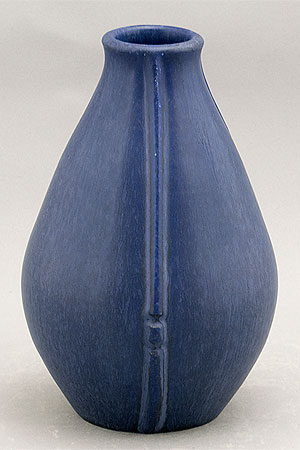
I really like this blue pot though. It's one of my favorites. It's a beautiful wannabe 'art deco' Arts+Crafts very subtly mottled, matte blue glaze. And an excellent shape - perfectly proportioned. The matte glaze is similar to that used on Door Pottery pieces. But I think this one is really old.

Tuesday, July 7, 2009

Sunday, July 5, 2009