This is about 7" x 11" on 300lb. Fabriano Artistico 'rough' watercolor paper with a brawny deckle edge. It's got some fiber paste on it and then some Colourfix primer. I did an underpainting with gouache. The rest is about 90% pans and 10% softies.
I like the creamy water in the foreground. I don't know why.
This pic is 'after' an old 'photogravure' from the Edward S. Curtis image collection at the Library of Congress. The photo is described as "Two tepees reflected in water of pond, with four Piegan Indians seated in front of one tepee." The LC record doesn't say when or where it was taken, but the Piegan Indians are a part of the Blackfeet Nation, whose reservation is in northwestern Montana, just east of the glorious Glacier National Park.
Edward Sheriff Curtis (1868 - 1952) was a photographer in Ye Olde West, concentrating on American Indians. And was quite jaunty himself, as you can clearly see. He is renown for his photos but also criticized for manipulating images to remove all traces of 'civilization' (see: the 'Noble Savage' concept) and for paying his subjects to pose in carefully controlled vignettes, in "inaccurate dress and costumes" and partaking in "simulated ceremonies". Still and all, he WAS mighty gosh-durn slap-mah-thigh cute.
+++++++++++++++++++++++++++++++++++++
15Nov09 ADDENDUM: Enjoyed the Kevin Locke Ensemble's 'The Drum is the Thunder, the Flute is the Wind' music, dance, and narrative presentation at the National Museum of the American Indian yesterday afternoon. The leader of the troupe's tribal affiliation and the origin of the story told in the first part of the program are both northern Plains Indian, so a nice segue from my (or to my) 'Aamsskáápipikani Pond' sketch. As well as a possible re-re-re-re-screening of the fan-fav Dances with Wolves . . . hmm.
Showing posts with label panpastels. Show all posts
Friday, November 13, 2009
Monday, November 9, 2009
Dandy? Dunno. Morandi? Dunno.
This is shown cropped to about 7" x 9". Done on pastelmat paper that I demolished with layers of fiber paste and Colourfix primer. I used about 90% panpastels. (Like the green hay bale on the right, eh? Woop woop)
It's 'after' Giorgio Morandi, an artist who is so serene and pristine and quiescent that one falls asleep contemplating his work.
But hey, maybe it's just moi (moi - it's all about moi). As usual.
At left is a composite of some of his still life pieces, for which he is 'famous'. Yaaaawn. Oh. Sorry.
It's 'after' Giorgio Morandi, an artist who is so serene and pristine and quiescent that one falls asleep contemplating his work.
But hey, maybe it's just moi (moi - it's all about moi). As usual.
At left is a composite of some of his still life pieces, for which he is 'famous'. Yaaaawn. Oh. Sorry.
Saturday, October 31, 2009
Still Life = Inanimate Objects
Well, it is (at least) my fav blue pot. The assignment was to use three colors. Does this qualify as blue, yellow ochre, and white? Ha.The gouache underpainting is below. It is done on recycled (washed off!) Pastelmat paper. Big slimey mess, too much gouache impasto made the surface a bit slick. Gouache = more watery next time!
Monday, September 7, 2009
Kelly Place
This is iteration #4 of this piece. It's 9" x 12" on PastelMat paper. About 85% panpastels and 15% softies. And just a touch here and there with pastel pencils. (Discuss.)Kelly Place: "Kelly Place is both an outdoor educational center and unique bed and breakfast located in the heart of the Four Corners, just 10 miles west of Cortez, Colorado, nestled between the red-rock canyons and majestic Sleeping Ute Mountain."
The original photo was taken by my friend John Robinson and is posted in this blog entry here. And reproduced below!
Sunday, September 6, 2009
Figgy Fiber (or 'Another Still Life that is a bit too Still')
This is 9" x 12" on a base of beveled museum board. I glued a thready, fibery-looking piece of crumpled rice tissue paper onto it, using Colourfix primer as the "glue". I put another coat of primer on, once the "glue" coat was dry.The underpainting was gouache, big flat color areas, no value, no modeling, no complicated thoughts at all. See below. (NB: I am beginning to consider this mindless underpainting as the way that I can invade the blank white page with some confidence. Like, hey, if I am going to practically cover it all over anyway, what's the harm? It seems to provide me a nice comfortable open door to the work.)
In any event, on Too Still here I used about 99.5% panpastels, fixed twice during the process with SpectraFix, and then just a few touches of softies at the very end.
The figs I bought at Wagshal's, which usually has great local produce. In this case, the figs taste awful. And I love figs! But they were photogenic and so I did break out the big camera and make some nice reference pix.
Friday, August 21, 2009
Thunderzoydosis
This is 9" x 12" on PastelMat paper, in the "Sand" color. I used about 75% panpastels and 25% my new Mount Vision Thunderstorm Greys set, which is way cool. And I also used one very scratchy, very impasto, very lush DT Thin Line white stick, for the hard cloud edges.I am not too sure about the way the clouds overlap, lower to higher --- I think it's the other way around --- but what the heck.
Thursday, July 23, 2009
For Cryin' Out Loud
More experiments with Golden's Fiber Paste, which I like. (It's texture seems to eliminate the additional step of having to apply the pastel primer on top of the other, more slick impasto gels.) This is 10" x 12" on crummy illustration board that buckled and warped under the pressure of all this gunk and stuff on top of it. Note to self: buy only good thick high-quality board.Click on the pic to open a bigger version, where you can see the texture. :)
It's about 95% panpastels and just a few jots or tittles of the soft sticks.
Wednesday, July 22, 2009
Sieve Mom or Pears In Winter
This is 8"x10" on reverse beveled illustration board. Latest gel medium is Golden's Fiber Paste, which is very nice! "This medium offers a dry film that has the appearance of rough handmade paper."I put down a haphazard messy layer of very soft pastels broadly, as an underpainting, and then palette-knifed on this new paste. Then I brushed the more prominent ridges out with a stiff brush. (I am not a valiant warrior.)
It dried nicely transparent and offered and excellent tooth for the pastels. But here is a passage from very interesting usage note from Golden, entitled Using Gels and Pastes: "A 1/4 inch thick film of a Gloss Gel will take a week or two, even in ideal conditions (70-80°F, relative humidity of 50% or less, and a moderate flow of air in drying area) to develop clarity. When humidity pushes over 80%, the same Gloss Gel may remain cloudy for several months."
What is cool about this is that my small studies might be still evolving and changing, as the various gels and pastes dry and cure. I like that idea!! I like not knowing how these will end up.
In any event, this pear piece is about 60% panpastels and the rest very soft sticks. I don't know if it was the new support or if I was particularly attentive or if it was just the lighting, but I could actually see the pastel particle sparkles on this one.
"Sieve Mom", n. the female version of helicopter parent
Friday, July 17, 2009
Shellee Pears
This is 8" x 10" on illustration board textured with Matte Super Heavy Gel and then prepared with clear Colourfix primer.I put the gel on in stripes along three sides, the bottom and the two sides, in the hopes that that texture would pop out. But it wasn't pronounced enough and the effect is too subtle for my tastes. Next time: more peaks and valleys.
I used about 85% panpastels and the rest very soft sticks.
This is after a painting by Shellee Sauer, posted here. Her background color is outstanding.
++++++++++++++++++++
BONUS PICS! The 2009 Pastel Show at the American Art Gallery in Takoma WA. Look at all 68
images. Excellent!
Sunday, July 12, 2009
Fence Challenge
This is about 7"x10" on a piece of cardboard that I prepared with a couple of coats of Colourfix primer.It's about half pans and half regular soft pastels. I played around again with the impasto textures, making a different surface in the different areas of the image. I suspect that this is a bit too much of a gimmick. Not sure. But the spiky prickly areas do come forward, which is useful.
Reference photo below.
Friday, July 10, 2009
Chippewa, Croatan, Tuscarora, or Shawano
This is an experiment with a new gel medium, called Matte Super Heavy Gel from Liquitex. It dries very fast and, when dry, is somewhat toothed enough to accept pans. Must keep notes on layers and mixtures, eh? Oh well.
What fun is that? Someday.The second is pans over an ink sketch in PR Velvet Black ink on tan Rives BFK print paper. The heads are from the bus ride and the couple from later, all of us waiting around at Sybaritic Station.
+++++++++++++++++++
BONUS PIC!
And a link to Suzy's Camp Yonahlossee Pow Wow web page. R.I.P. Camp Yonahlossee 1923-1985. (Facebook group here. Ha!)"Oh, Chippewas, we hold your standards high. We love to sing your praises to the sky. Your colors red and white shine all around, and when we think of you we're mighty mighty proud. . . "
Wednesday, July 8, 2009
Still Life that's a little too damn still
I am sure it's important to practice "seeing" with still life subjects, but it can get boring. Least for me.This is 8"x10" on white Aquabord that I coated with clear Colourfix primer. I put the underpainting down (in pastels washed with watercolors - very clumpy and messy - will use alcohol on pastels next time), in very bright compliments.
Next I buried it all in Talens Heavy Gel Medium Matt: circular palette knife contours on the pot area, flower-shaped contours on those, and horizontal contours on the table and background areas. (The Talens matt medium, as is always the case with me every time I find something that I like, appears to be discontinued. Found a few remnants online and bought them, so I have enough for a while. Sheesh.)
It's about 75% pans and 25% regular pastels. It's nice but very boring.
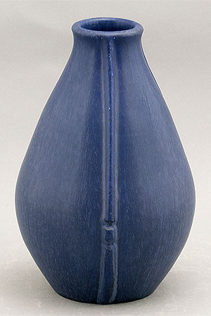
I really like this blue pot though. It's one of my favorites. It's a beautiful wannabe 'art deco' Arts+Crafts very subtly mottled, matte blue glaze. And an excellent shape - perfectly proportioned. The matte glaze is similar to that used on Door Pottery pieces. But I think this one is really old.
Monday, June 29, 2009
Cajun House
This is about 6-1/2" x 11" on textured print paper glued to illustration board, sealed with clear Colourfix primer. (The edges are very raggedy, which looks nifty.) It's done almost entirely in panpastels, over a bright reddish magenta underpainting.The scene was difficult because the whole ensemble was back-lit. I wasn't sure how to deal with the lighting and the value range. The sides of the buildings facing me were actually very much darker than this.
I am going to do this scene again, larger, and with more sky and trees. I like the symmetry of the trees/sky shapes that I created (with Photoshop) at the top of the pic below. I also like the overall shape and the proportions much better. It echos the centeredness of the walk and bridge and door line.
Here is the reference photo of the old Louisiana homestead, and another angle on the house. Both pics are very much photoshopped.

Sunday, June 28, 2009
To knead, to merge = impastare
I made the mistake of buying the most perfect pear yesterday at the grocery store . . . More experiments with impasto and layering with transparent gels. This one is done with Golden's Heavy Gel (Gloss). I put it on only the pear shape. It dried both quickly and nicely transparent. But the glossiness was trouble. I had to add a layer of clear primer to get any hold at all, which obscured the transparency. Live and learn! (It comes in a matte version. Must try too.)It's about 6-1/2" x 8" on Japanese print paper that I glued to a piece of cardboard. I like the raggedy edges.
This next one (below!) is done with Talens' Heavy Gel Medium Matt, applied to the pear shapes and to the tabletop area. It dried quickly too and semi-transparent and only needed a coat of fixative in order for it to hold pigment. This medium is a 'keeper'!
It's 8" x 10" on a piece of peachy-toned illustration board, sealed with clear Colourfix primer.
Both of these were done with about 90% panpastels and about 10% with very soft sticks. (The more I use the pans the more I look forward to the dark set that is coming.) First I laid in the big shapes with soft pastel sticks. Then I palette-knifed on the gel, on top of that first layer, which picked up and spread the pigment.
The pans were rubbed into the texture a bit. Last I put the final touches on with the soft sticks, just flitting over the tops of the textured surface. Interesting effect.
Thursday, June 25, 2009
Autre haute butte
This is just a very quick sketch. It's about 6" x 9" on "blue haze" Colourfix coated pastel paper. It's done with almost all panpastels over a real messy underpainting of pastels and watercolors washed with alcohol and water mixed together. (Big mess!) It's super unfinished and just dashed off. No thought given to composition. The focal point is smack dab middle. Sorry!I am surprised to say this, since noted experts disagree, but I don't like the Colourfix paper with the panpastels. It's too slick and slippery. No grab. But the Colourfix primer on paper? Perfect! Maybe I got an old mistreated piece of paper . . .

+++++++++++++++++++
Bonus PIC! --> Queen Elizabeth II "decorously dropping the puck at centre ice for the ceremonial opening face-off in a pre-season friendly between the Vancouver Canucks and the San Jose Sharks", October 7, 2002. (Toronto Star, 7Oct02,
p.A01) This pic makes me smile every time I look at Mike Ricci's face.Tuesday, June 23, 2009
We are all in this together, remember
This is about 7" x 8" on pastel paper. The sketch is in PR Velvet Black ink using my pointy old Esterbrook fountain pen. I washed the lines a bit with the waterbrush, then came back later with the panpastels.These are a few of my fellow commuters. We are all in this together. Damnnit.
Sunday, June 21, 2009
Zen Garden
I trust the leaves are a bit better on this one. But they were hard.It's 7-1/2" x 11", on illustration board which is beveled along the edges, so the ground colors go down the bevel, right to the edges. It's prepared with clear Colourfix primer. Underpainting done with pastel sticks, washed with alcohol. And sealed again with clear primer.
I used all pans, about four layers. I used regular pastel sticks for the stems.
The source pic is below. I took it myself, so this one isn't "after" anyone else's work.
I might be done with pear plan, finally.
Chili-peppear
This is 8" x 10" on illustration board coated with primer, as usual. And also done with a few layers, and all pans, except for the stems. IRL this is more hard-edged and marky. Not so dreamy.The underpainting is below. I did that with gouache.
It is after a Creevy oil stick demo painting on page 167 of his book.
I am not sure yet if I really like the pans. I will persevere.
Two useful links, from Donna Aldridge:
- pdf on how to decide what color of Art Spectrum Colourfix pastel paper to use: Which color should I use?
- New pan pastel video demo: Stormy Landscape
- All of Donna's panpastel videos are here
Saturday, June 20, 2009
At-cha, at-cha
This is very small, about 7" x 4", on illustration board. I experimented with thick layers of transparent Liquin Light Gel/Wingel mixed with pastel 'in solution'. It's interesting but not as much fun as the flatter scratchier texture on the background. This is clear Colourfix primer on top of both the dried gel smears and a very bright overall underpainting.Again, I used all pans except for the stems and the pink fire in the top background. Despite the small scale, I stayed away from the weeny applicators. Bravo to me.
Next step? Dunno. Mix the primer with the (hopefully) quick-drying acrylic gel that's on the way. Yeah! Big mess.
Friday, June 19, 2009
Oddly schody
This is from a ballpoint pen sketch that I bought from a street artist in Prague, in what was then Czechoslovakia.It is 6" x 9" done entirely with pans. It's on white Wallis "professional grade" paper. This is the first piece I have done with the pans where I used the little eyeshadow applicators. I don't like them nor do I like the dot-diddlyness of the marks I made with them. Nah.
Need to stick to the more expansive, less fussy gestures/tools.
Subscribe to:
Posts (Atom)