Sunday, May 24, 2009

Rigid and Grim?

Who are these men? Are those loose pieces detached limbs? Or do they represent other severed detached appendages? Are these sacred effigies or are these a child's dolls? They are dated AD 1020-1140. About the time of the First Crusade in Europe and the penning of La Chanson de Roland. The fellow on the right: ears or ear ornaments?

These two men . . . (Look at their faces. How could they be other than men? Both of them.) These two men were found at Pueblo Alto, located on a mesa top overlooking Chaco Canyon. Pueblo Alto is one of the greatest of the Great Houses in the Ancient Southwest. It is the central point for a radiating series of ancient ceremonial roads. Evidence indicates that Pueblo Alto wasn't a residential Great House, however, but a ceremonial site. Intermittent occupation and an enormous midden, with an estimated 150,000 broken ceramic vessels. Far more than would be 'expected' from a resident population. Smashing ceramic vessels after a feast was a common practice back in the day. Imagine very large and noisy ceremonies.

Just who are these men? Rigid, grim, and vengeful? Or serene and protective?

Saturday, May 23, 2009

"Figere" (to fix, fasten, make stable)

With "fixative" on hand, it's difficult to know where or how to stop. Yeah, the fresco look is enticing, but gimme a break.

These squashed oranges are after a demonstration piece in my favorite how-to pastels book, by Bill Creevy: The Pastel Book: Materials and Techniques for Today's Artist (and go to page 124 after searching for the word 'paste') He is using it to demo a technique that layers the pastel with "modeling paste". Creevy is my hero. What the heck is modeling paste?

My piece is about 9" x 6", on 500 grit UArt paper, tinted a neutral gray with PR Velvet Black ink, which was diluted with water. I used mostly Ludwig and Mt. Vision pastels, all very soft.

Wednesday, May 20, 2009

Limited Stop


This is pen and ink, worked on later with Conté Pastel Pencils. The 37 is my new favorite bus. Especially on exquisitely lovely days when any feeling sentient being don't wanna travel underground. No way.

++++++++++++++++++++++++++

Book find of the week is 50 Secrets of Magic Craftsmanship, by that raving lunatic Salvator Dali, originally published in 1948.

A sample: "The two most fortunate things that can happen to a painter are, first, to be Spanish and, second, to be named Dali. Those two fortunate things have happened to me." S.D. (Another loony behemoth, Frank Lloyd Wright, had a similarly large opinion of his own merit. Q: Does genius often come with such a burden?)

I was reminded of my visit to the Dali Museum in Figueres, outside of Barcelona, and all the wonders therein. Particularly the rusted car in the leafy central courtyard with the manikins inside that spouted water.

Monday, April 27, 2009

Mean as a snake

This is on peachy colored (not so orange) pastel paper. Done with ink and later mucked up with gouache and pastels.

These folks are on Metro and this was possibly the last day of dreary cold wet weather for quite a while. We'll have dreary and wet, but cold? Think not.

The foreground gent is starting to look a bit familiar to me. Is he real or is he some kind of standard old guy that I keep "seeing". Dunno. Dunno.

Sunday, April 26, 2009

I see sky

Yesterday I had the pleasure of attending a meeting of the Maryland Pastel Society! It consisted of four simultaneous demos, one going on in each corner of a big assembly room, where each demo/teacher spent a half an hour or so on her topic. The audience rotated at will among sessions.

The four topics were intended to get the membership ready for plein air work:
  • the sky and clouds
  • verticals (trees and hills)
  • the land
  • water
The pic on the right, above, is from the sky/clouds demo given by the group's president, Jean Hirons. She had a piece of paper divided into quarters (as you see) and did each of her demos on one of the panels. The one I watched was done on the third panel from the left and the sky treatment differed considerably from the other two! It was fun to compare and contrast as she painted. Important tip: the sky should echo the ground in temp/color/tint. This ties the piece together.

The verticals demo was done by Lisa Sheppard. I very much enjoyed watching how she built her value masses, based on the angle from which each mass was lit. And then she brought them to life with just a few additional strokes.

The land demo was done by Mary Anne Warner, a 'realist' painter of large skill, who (unfortunately for her, here in this locale) hates green!

The water demo was seriously instructional, based upon the correct premise that the more you know about a thing, the better you'll paint it. It was presented by Deborah Maklowski. (Another excellent How-To-Paint-Water in pastels demo is here.)

Two books were mentioned reverently by more than one presenter:
--- Carlson's Guide to Landscape Painting, by John Carlson (1958)
--- Capturing Light & Color With Pastel, by Doug Dawson (1991)
From what I saw, the Carlson book looks pretty interesting. We'll see. It's on the way!


++++++++++++++++++
ADDENDUM: On the way home I discovered an outstanding little grocery market in Olney (west side of Georgia Avenue): Roots Market. Great spot! Really good stuff. Decent prices. A little Dean+Deluca and a little Whole Foods. I intend to go back often. Wish there was one closer!

Friday, April 17, 2009

The Hounds of Hell

Bravo to the Terriers of BU, the NCAA hockey champs this year! The Frozen Four was a remarkable experience of a novel brand of ice hockey for me, one entirely devoid of hype, promo, and (most surprisingly) beer sales! To see the arena with all it's advertising erased and/or shrouded was like breathing fresh air. The pep bands, the hoards of students, the 'cheers', all really neat!

(To see and hear it all back to 'normal' on Wednesday night was like going back into a dank and smoke-filled, yet familiar and homey, neighborhood pub. Filled with all your dear old familiar loud-mouthed friends. Ahhhh. . . home!)


This is in my sketchbook, about 8' x 8' on Aquarius II, in PR Velvet Black ink in my Lamy Vista fountain pen. It's washed with a waterbrush later. I made the sketch between the two semi-final games on Thursday night. The view is from our seats for the tourney, which were smack up by the ceiling. The far end of the rink was so far away from us that there was a time delay before we heard the **whack** sound of a shot being taken on that far goal. I mean, these seats were UP THERE. Stratospheric.

Monday, April 6, 2009

Make 'Standard Man'

This recent workshop, Basic Figure Construction was quite interesting and useful. Our instructor was Malone Samuels, who has been teaching drawing for decades and is extremely skilled and soooooo patient.

He also teaches cartooning classes and he mentioned a 'gesture ' figure drawing class that sounds wonderful to me. I really enjoyed his approach, his ideas, his mixture of measurement plus calculation with emotion/intuition.

I put all my notes from the workshop in my everyday sketchbook and will try to refer to them daily. I didn't do well at all with the models during the weekend, but am SURE that these 'principles' will help every day.

Friday, April 3, 2009

Inter-Lock

Thank you to my friend Sam for suggesting that a border drawn around my interlocking figures might help pull them into an ensemble. I am not sure a square is the answer, but the concept is full of merit and I will continue to make stabs at it.

Thank you, Sam!

(This is about 7" x 7" on gray charcoal paper, done with PR Velvet Black in my Lamy Vista fountain pen. Washed a bit on the spot with the Pentel waterbrush.)

Tuesday, March 31, 2009

Who is Captain "A"?

This is on charcoal paper, done on the spot with pen+ink, then abused later with NuPastels and then with gouache.

Stopping just a hair past making a mess.

New gimmick: trying to connect each figure with the adjacent using a continual line. Goal: a pleasing layout/design for the page. Grade so far: a miss. Those two in the center are a little too close for comfort.

A Mess and a Miss. Great!

++++++++++++++++++++++
Q: Who is Captain "A"?

Saturday, March 28, 2009

Stubs for the Road

Based loosely on BOTH Michael Chesley Johnson's Extreme Limited Pastel Palette AND Casey Klahn's Six Unisons post ("What I am about to reveal will change your plein-air life forever."), I have been messing around with a sketch pastel kit that would be handy to keep in my everyday bag. It's in an Altoids box and is padded inside with just enough foam to keep the weensy stubettes from rattling around. Add a rubberband, just to be sure, and I am ready to rock.

These are almost all NuPastels, with a scattering of Conté and Polychromos.

I intend to experiment with it this week. Will report!

+++++++++++++++++++++++++
Value v. Temperature, from MCJ, showing how value ain't the be-all-and-end-all. Color temperature also 'telegraphs' value.

Friday, March 27, 2009

Nulla Dies Sine Linea

The Ramblers was the name of a Washington DC sketch club founded in 1913 by local artists Charles H. Seaton, Winfield Scott Clime, and Edwin G. Cassedy. It soon grew to four, to include Benson Bond Moore. The Ramblers soon became the Washington Landscape Club, which evolved into the now-prestigious Washington Society of Landscape Painters.

"The motto of the Ramblers was "Nulla Dies Sine Linea," (Not a Day Without a Line) and their Log-Book describes a jolly but dedicated group of men sketching at every opportunity." (from 'Historic Plein Air Society Embraces 21st Century', by RG Ray, in American Artist, 25Mar02.)

Except for being a 'men only' club (which was an actual, explicit club rule), the Ramblers sounds like a gang to be emulated.

Tuesday, March 24, 2009

The Final Battle / AP Hill arrives just in time

This is a view of the "Final Battle" area on the Antietam Battlefield. (The sketch is about 9" x 11" and is on tinted paper in a spiral-bound pad. I coated the paper with clear Colourfix Primer. Done with a mixed bag of soft pastels, mostly Diane Townsend.)

"Southeast of town, Union General Ambrose E. Burnside's troops had been trying to cross a bridge over Antietam Creek since 9:30 am. Some 400 Georgians [General Toombs' brigade] had driven them back each time. At 1 pm the Federals finally crossed the bridge (now known as Burnside Bridge) and, after a 2-hour delay to reform their lines, advanced up the slope beyond. By late afternoon they had driven the Georgians back almost to Sharpsburg, threatening to cut off the line of retreat for Lee's decimated Confederates. Then about 4 pm General A. P. Hill's division, left behind by Jackson at Harper's Ferry to salvage the captured Federal property, arrived on the field and immediately entered the fight. Burnside's troops were driven back to the heights near the bridge they had earlier taken." The Battle of Sharpsburg was over. (Map.)

The monument in the sketch is the 11th Ohio Volunteer Infantry Monument. It is on a mound bounded on two sides by a curved retaining wall and it dominates the little hollow between the new Branch Avenue (where I am) and the opposite ridge, which is the heights above Antietam Creek and Burnside's Bridge further to the east.

Pastel Plein Air

Here is my Blackfoot, from Alla Prima, the best pochade box on the planet, tricked out for pastels. I was on the Antietam National Battlefield on Sunday, sketching away here and there. It was a lovely day.

The painting is on a spiral-bound pad that's held open with the spring clip. It's held firm onto the box with the regular Alla Prima panel clips.

The bigger pastel box in the middle folds closed and fits into the right hand drawer for transport. The two smaller boxes have their own tops that are secured and I carry the boxes separately, in the rolling carrier. The box on the left is built with the Open Box brass brush tray. (The hooks work perfectly on the Blackfoot!) The box on the right sits open, in the drawer, while I'm painting.

The design, workmanship, details, materials, everything about the Alla Prima Blackfoot, suits me to a T. I love it! My three storage boxes leave a bit to be desired (I pretty much slapped 'em together) but the whole system works well for me. I can swap out the pastels for the gouache set-up in a jiffy as well.

I use an ancient Gitzo 026 tripod, at one time considered the "ultimate backpackers tripod". (Today an equivalent might be one of the tripods in the their Mountaineer line.) I do use a good-quality quick-release ball head, however, since I am not into wrestling with the pochade box: the G1276M head. It may weight nearly as much as the tripod. But the ease-of-use is worth it to me.

And here is the Blackfoot with my black folding chair in front and the red rolling carrier next to it.

Friday, March 13, 2009

Gouache Garden Sketch

This is a gouache sketch on the Paperchase kraft paper. There are a few views of folks sitting in the Kogod Courtyard the other evening. This beautiful space is in the middle of the historic Patent Office Building, which now houses the National Portrait Gallery and the Smithsonian American Art Museum.

The museum complex is (very cleverly) open until 7pm, so folks can scrounge food at the Courtyard Cafe before hockey games at the arena right directly across the street.

Sunday, March 8, 2009

Sketchbook / Road Trip 2008


To see this in full screen, click here and then click on the little full screen symbol in the lower right hand corner of the video screen.


Sketchbook / Road Trip 2008 on Vimeo.

Saturday, March 7, 2009

Hang on! Spring is coming.

LinkThis is on the heavy kraft paper torn out of the Paperchase scrapbook. PR Velvet Black ink and gouache.


Below is another from Metro, done with Noddler's Nightshade and gouache.

Wednesday, March 4, 2009

Pears on Red

This is gouache (and a little watercolor, especially that wonderful acidy DS Green Gold) on Arches rough, about 6" x 9" after cropping. It is after a pastel that I saw the other day, by Barbara Noonan.

I scrapped on the thick red-orange paint in the background with the palette knife, which was kind 'o jazzy. I can see that much of the gouache fun is going to be the impasto aspect. Cool!

Tuesday, March 3, 2009

Gouache en Plein Air


I had decided to convert my regular sketch kit from watercolors to gouache, so I got out a small folding box with half pans and filled 'er up.

THAT didn't work at all.


Since the box wasn't sealed, it was impossible to keep the paints in the open pans at a constant moisture. They just dried up, cracked apart, and went all over.

I don't want to carry whole tubes, so I decided to make a variation of Jamie's great plein air kit.

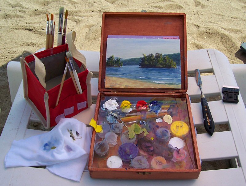
I got one of those snap closure food storage boxes from the Container Store, about 8" x 5" x 2" deep. The kind that seals tightly with an 'O' ring.

Then I took a 6" x 4" x 1/4" piece of plexiglass and epoxied 10 of those little paint cups onto the edges of that. Above is the plein air box, shown open, next to a 7x10 Arches paper block. The box on the left, the lid/palette on the right.

In the box on the left there is a folded piece of paper towel in the bottom. The plexi piece with the cups is on top. There is a small water bottle between the cups, a piece of damp sponge at the bottom, an extra paint cup, and a tube of white gouache. The brushes are on the side and the cut-down palette knife is in the middle.

I laminated a piece of paper (which I had printed a neutral gray) onto the outside of the lid. I am using the inside of the lid as my palette, as you can see. The colors are much easier to deal with on that neutral gray background. (There is another rolled up piece of paper towel sitting at the top of the lid/palette.)

This is pretty handy, so far. If I can't keep the leftover paint on the inside of the lid from drying up and flaking off, I will have to clean the palette area off after each session. I am going to try to keep it moist by keeping that sliver of a sponge moist. We'll see.

The size is just right. The palette mixing area in the inside of the lid is a good size too. The only thing missing is one of those big water containers. Which could be carried separately.
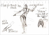
Saturday, February 28, 2009

My New Neighbors

This is Nooder's Nightshade ink on Waterford Aquarius II paper that I had tinted to a kraft color with an acrylic wash. I was worried that the wash was going to abrade the paper so badly that the ink would feather. But it didn't. Bravo ink! Bravo paper! (I should have more faith.) Sketch later touched up with my new Schmincke Horadam Gouache. (Gad but it's expensive!)

Saturday, February 21, 2009

This bus brakes for sausages.

Bus. Front steps, columns, and leafless elm from the front of the National Gallery of Art. And a face from Metro.

Friday, February 20, 2009

Stay Alert!

This is a very nearly chinless lady on Metro, done in PR Velvet Black ink, later messed up at home with gouache. (I may like this kraft-colored watercolor paper better than the kraft paper. Hmmm!)

I am attempting to see how portable gouache is. It has such a tendency to dry out and crack apart, that it may not be very plein-air-ish. Keeping it soft enough to stay put and solid enough to stay put, simultaneously, is tricky.

Sunday, February 15, 2009

Campania For A Day

I enjoyed my whole Birthday Weekend, including the Resident Associates seminar on Saturday, entitled Ancient Pompeii: Modern Views. It was organized in conjunction with the delightful show at the National Gallery of Art: Pompeii and the Roman Villa: Art and Culture around the Bay of Naples. (The first and the last speakers possessed very similar, very droning, very affected, very professorial delivery styles. Made you want to scream. Turns out they are married. Wouldn't you know!)

The third speaker, Professor Christopher Gregg, from GM had the most interesting section, about the pleasures and entertainments common in ancient Pompeii. I am thinking of trying to find a cookbook of ancient Roman recipes and try some of their fish dishes. Wonder what they will be! We also heard about Pompeii's Spectacula (or amphitheater), the venationes held there, and the Lupanar.

In any event, I made this sketch of Mt. Vesuvius and then the little map of il Golfo di Napoli below it, during the final speaker's section. I added gouache washes at home today. I like the way the summit caldera is rendered. Not exactly 'to scale' obviously, but it looks cool. Or, ummm, hot. . . . One of the speakers was asked about plans to excavate the 'Unexcavated' portions of Pompeii. His answer was kind of scary; he said that the heartily agreed with the policy currently in place to leave these areas unexcavated permanently. He said that these areas are well buried and that they will survive when the next pyroclastic event occurs at Pompeii. These buried areas will survive when everything that is exposed right now is destroyed. Not "if", but "when". When the next eruption occurs. Gave one the shivers.


This is 'The Forum at Pompeii with Vesuvius in the Background' by Christen Schjellerup Købke painted in 1841, now at the Getty in LA. The Getty Villa having been modeled on the Villa dei Papyri, in Ercolano.


Here is another lovely view of Vesuvius, from the beach of Naples, entitled 'Am Strand von Neapel' painted by Oswald Achenbach, probably around 1885.

Thursday, February 12, 2009

Black? What?

Goodness me, I don't know! This is about 6" x 7-1/2", gouache on black Arches cover. I have seen some very nice pastel and gouache work on Somerset Black Velvet and this is a test to see if I want to order some. Next test will be pastels on the Arches black.

The Somerset Black Velvet is considerably heavier (250 gsm) than the Arches cover (136 gsm). Interesting! Might be like illustration board.

Gouache en Plein Air! Here is a great pic of a perfectly adequate gouache kit
for relaxed and happy plein air work. Thanks, Jamie!

Monday, February 9, 2009

Aphrodite Venus de Capua

I visited the Pompeii show at the National Gallery of Art -- Pompeii and the Roman Villa: Art and Culture around the Bay of Naples -- and enjoyed my first glimpse very much. This is a quick sketch from one of the only benches in the entire exhibition. (Why do they do that?)

Aphrodite = Venus


I used PR Velvet Black ink in the Lamy Vista, later washed with the waterbrush and some gouache for background tint.

Friday, February 6, 2009

ONE random thing


This is done on Daler Rowney pastel paper, cut to fit and and snapped into my 7"x8" everyday sketchbook. The initial sketch is with Noodler's Red-Black "near bulletproof" ink in the old trusty Lamy Vista. The gouache was added later. I like the lights of the gouache on this blue paper. Will do more with my new paint box!

I have also been using an old Bloomies shopping bag, turned inside out, and pieces cut to fit my sk
etchbook. The kraft color is nice but it's too flimsy. I have received two excellent kraft paper sketchbooks sold by a UK company called Paperchase that have much nicer much thicker kraft paper. I want more of 'em so I don't have to be too careful about using them up.

There are some wonderful kraft paper and cardboard box sketches from our local Mr. Christian Tribastone here. And some nifty gouache sketches
done by Jamie Williams Grossmanon on kraft here and here and here. Real nice!!!

Inspi
red by all that I have made up a small paint box with gouache. I am going to try to get out with it this weekend and sketch. Some of the colors are real runny (mostly the Graham brand tubes) so I am having to leave it out all night to get it to dry out and "set up" a bit. So when I close the box the paint won't run all over. We'll see how hard they are tomorrow morning.