 This is on the heavy kraft paper torn out of the Paperchase scrapbook. PR Velvet Black ink and gouache.
Below is another from Metro, done with Noddler's Nightshade and gouache.
This is on the heavy kraft paper torn out of the Paperchase scrapbook. PR Velvet Black ink and gouache. This is gouache (and a little watercolor, especially that wonderful acidy DS Green Gold) on Arches rough, about 6" x 9" after cropping. It is after a pastel that I saw the other day, by Barbara Noonan.
 This is Nooder's Nightshade ink on Waterford Aquarius II paper that I had tinted to a kraft color with an acrylic wash. I was worried that the wash was going to abrade the paper so badly that the ink would feather. But it didn't. Bravo ink! Bravo paper! (I should have more faith.) Sketch later touched up with my new Schmincke Horadam Gouache. (Gad but it's expensive!)
 Bus. Front steps, columns, and leafless elm from the front of the National Gallery of Art. And a face from Metro.
 This is a very nearly chinless lady on Metro, done in PR Velvet Black ink, later messed up at home with gouache. (I may like this kraft-colored watercolor paper better than the kraft paper. Hmmm!)
 I enjoyed my whole Birthday Weekend, including the Resident Associates seminar on Saturday, entitled Ancient Pompeii: Modern Views. It was organized in conjunction with the delightful show at the National Gallery of Art: Pompeii and the Roman Villa: Art and Culture around the Bay of Naples. (The first and the last speakers possessed very similar, very droning, very affected, very professorial delivery styles. Made you want to scream. Turns out they are married. Wouldn't you know!)

 Goodness me, I don't know! This is about 6" x 7-1/2", gouache on black Arches cover. I have seen some very nice pastel and gouache work on Somerset Black Velvet and this is a test to see if I want to order some. Next test will be pastels on the Arches black.
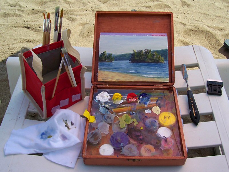
 I visited the Pompeii show at the National Gallery of Art -- Pompeii and the Roman Villa: Art and Culture around the Bay of Naples -- and enjoyed my first glimpse very much. This is a quick sketch from one of the only benches in the entire exhibition. (Why do they do that?)

 red by all that I have made up a small paint box with gouache. I am going to try to get out with it this weekend and sketch. Some of the colors are real runny (mostly the Graham brand tubes) so I am having to leave it out all night to get it to dry out and "set up" a bit. So when I close the box the paint won't run all over. We'll see how hard they are tomorrow morning.
 Tree in Norwood Local Park. About 4"x 4", on tinted (did it myself, with watercolor wash) Aquarius II wc paper, done with a Kaimei "Natural Hair" brush pen, and then watercolors and gouache later. From the front seat of my car on a frrrrrrrrigid + gloomy day but I just effing HAD to get out.

 After all the revelry, excitement, and celebration of the past few days, are we all back to the same old slog? This is a little (7"x4") top o' the hill "study" that I found while tidying (re-arranging) the desks. It has a nice spring breeze going through it. What shall we do to get ready for Spring?
 I am trying to reconcile the two "creativity" workshops that I took this past weekend with the resumption of school this week. I suspect that there are common threads between them but maybe I'm too tired to concentrate hard enough to see 'em.
 Getting closer and closer to Inauguration Day. Today Virginia feels marginalized and victimized. Hey! Who said the War of Northern Aggression is forgotten? As per Alexandria's Congressman Jimmy Moran: the closing of all the Virginia bridges is "security on steroids." Paaaaah-leze! Like the Secret Service ever gave a flyin' fig about the every-day functioning of this city. Of course it's security on steroids. C'est leur point fort. Ils sont goons. Qué será, será, eh?
 Sketchbook page from the last day of the year. Detail of the edge of a cabin (and some other nearby neighborhood elements) in New Market MD. About 7"x7", on grey charcoal paper, on the spot (albeit inside the car --- hey, it was about 29º and windy!) with pen+ink and then (later at home) with watercolors, gouache, and mushed-up watered-down pastel (for the sky). Cool.
 This is about 7-1/2" x 10" on very rough Saint-Armand Colours paper in a washed denim color (nice flecks in it, obviously hand mixed / hand made). I coated it with clear Colourfix primer. Then I started out with a big sloppy mess of an alcohol wash, washing in the (sort of) complementary colors to what I was intending for the finish layer.
 Experiments with an alcohol wash underpainting, coloring a "print" of an old sketch, and a strange Art Deco color scheme plus eerie detached (sleeping?) floating-head subject, the later two attributes both ala Redon.
 La Coquille Odilon Redon (22-1/2" x 22-3/4")
 The painting sequence / process, from Professor Bob Rohm:
 This was my best drawing from the Crash Course In Drawing class this past weekend, using a grid and transferring the layout from the photo. It's overall 18" x 24". Done with charcoal, Char-Kole, and chamois, paper towels, and erasers!
 Here is a pastel paint-by-numbers piece, using one of my carborundum prints as a base drawing.
 These are some sycamores below my window. As the season moves on I'll see more and more of the white bleached-bone skeleton. They say the best way to learn to draw trees is by careful observation. Maybe I'll make these my special study. Since they are quite handy.