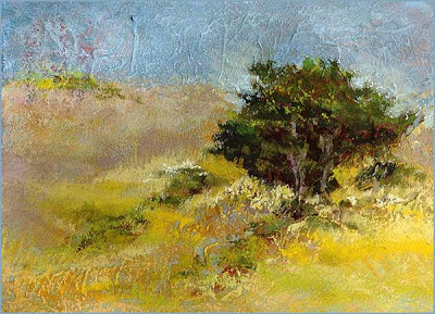
This is a very small sketch on UArt 320 grit paper using mostly the new set of Girault pastels that arrived last night : the
Brilliants. Since the Girault line of pastels isn't loaded with what I would call brilliant colors, I was curious to see how they would manage to select a set of fifty so designated.
Verdict: Nice try. Except for some bright and strong reds and oranges, it's a charming set of very usable colors. Nothing outlandish or garish. Or brilliant. Right in line with the Girault philosophy. (Well, there is one fairly outlandish phthalo-like greenish . . . . something. But I'll forgive them.)
I hope to use some of these new pieces to replace some other similar (but larger and softer) pieces in my traveling
Sketchbox Double. But I do not ever imagine being able to fit out a traveler with nothing but Giraults. Too many light values and strong colors are missing. Plus, soft light bright pastels are a must for the last layer, as can be seen in this piece. Love that impasto!
++++++++++++++++++++++++++++++++++++
. . . and forgive us our tresspasses, as we forgive those who trespass against us . . .
This is becoming a harder and harder exchange to make. As one grows old, selfish, and self-absorbed, one finds it more difficult to forgive trespasses in others. Not just forget about them and move on, but really sincerely actively forgive. It takes work. Which, now that I think about it, is the whole point.


 What I especially like about this one is the nifty little outdoor picnic hibachi that the lady in pink is working with. Can't you just smell the teriyaki salmon and hear it sizzling? Spring can NOT arrive soon enough.
 This is another small piece, 5" x 5", done with pastels, on 320 grit UArt paper. It's hopelessly overworked, in my opinion. But I got carried away. I do like that one spot of sunlight, just behind where the two slopes overlap.
 This is a very small sketch on UArt 320 grit paper using mostly the new set of Girault pastels that arrived last night : the
  This is a land art sculpture in Egypt. It is the most exquisite object I've seen in some time. Click on the

 It's remarkably difficult for me to find source landscape scenes (that I can steal/commandeer) that don't have central flat, calm, and securely grounded areas situated front and center. You know. Quaint recumbent meadows or serene marshes. Right now I am interested in making pictures of outdoor spaces that are insecure, roiling, precipitous, and worrisome. There aren't a gazillion models out there, in any format. (Other than the classic Grand Canyon overlook pictures.) I am experimenting with taking larger works and cropping out all but peripheral steep and sloping areas. It's not a very satisfying way to find or create this kind of source material. But, hell, hermits can't be choosy. So oh well.
 This one is 5" x 5", cropped. It started with a much large nearby tree on the left side. But as I worked the dark green limbs and played around with the foliage mass, that big tree kept growing across the page. Eventually it covered almost the whole left side of the sheet. Too big! The distant line of trees on the ridge line got lost in the shuffle. So I extended the 'scene' further to the right, and re-cropped into a square. I like it better now.
 Happy 258th birthday to the miracle that was and still is Mozart.


