 I am sure it's important to practice "seeing" with still life subjects, but it can get boring. Least for me.
This is 8"x10" on white Aquabord that I coated with clear Colourfix primer. I put the underpainting down (in pastels washed with watercolors - very clumpy and messy - will use alcohol on pastels next time), in very bright compliments.
Next I buried it all in Talens Heavy Gel Medium Matt: circular palette knife contours on the pot area, flower-shaped contours on those, and horizontal contours on the table and background areas. (The Talens matt medium, as is always the case with me every time I find something that I like, appears to be discontinued. Found a few remnants online and bought them, so I have enough for a while. Sheesh.)
It's about 75% pans and 25% regular pastels. It's nice but very boring.
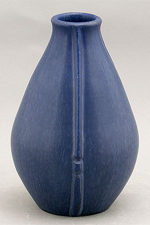
I really like this blue pot though. It's one of my favorites. It's a beautiful wannabe 'art deco' Arts+Crafts very subtly mottled, matte blue glaze. And an excellent shape - perfectly proportioned. The matte glaze is similar to that used on Door Pottery pieces. But I think this one is really old.
No comments:
Post a Comment