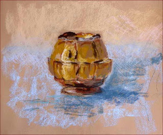
 This is part of the homework for the last session of the pastels class at the Smithsonian. I tried this same ceramic pot in a number of different colors on different surfaces/backgrounds. I liked this one the best. It happens to be (a) the actual color of the pot and (b) the first one I did. Lesson: Observe closely and then savor beginner's luck.
It's about 9x12 on Daler-Rowney pastel paper (which I had bound with a spiral binding so I could use it as a sketch pad) coated with clear Colourfix Pastel Primer. I used Townsends, GAs, and Ludwigs. Mostly.
I bought three Roches the other day and for the life of me can't figure out what all the big fuss is about. The Townsends are nicer, to my mind.
Revised 3Dec12
"A" List -- Excellent books. I refer to them over and over:
- The Pastel Book: Materials and Techniques for Today's Artist, by Bill Creevy (1991) -- This is my favorite by far. It's considerably out of date with regard to the materials (some of his delightful-looking papers
 don't exist anymore) but his diverse and out-there-on-the-edge techniques are all fascinating and show the versatility and vitality of the medium.
- The Pastel Artist's Handbook: Materials, Techniques, Color and Composition, Style, Subject, by Sally Harper (2004) -- Good advice, very complete.
- Degas Pastels, by JS Boggs and A Maheux (1992) -- Inspirational! Ed Degas is thought the modern 'master' of the medium. Good reproductions. Useful commentary on each piece.
- Raw Color with Pastels, by Mark Leach (2006) --- Again, as with the Creevy book, examples of how far and how wide pastels can take you. Buy this one just to see the surprising images.
"B" List -- Interesting but certainly NOT necessary. The "A" List books are far better:
- The Art of Pastel Painting, by Alan Flattmann (1987) Very dated, but still containing some good advice with regard to materials, studio organization, and techniques.
- Painting with Pastels: Easy Techniques to Master the Medium, by Maggie Price (2007)
- Pastel Workbook: A Complete Course in 10 Lessons. by Jackie Simmons (2007)
- Pastel Painting Techniques, by Guy Roddon (1987)
- Pastel School: A Practical Guide to Painting and Drawing with Pastels, by Hazel Harrison (1996) -- Along the lines of the Harper book. Nicely illustrated.
- Capturing Radiant Light and Color in Oils and Soft Pastels, by Susan Sarback (2007) -- This is the spiritualist/kumbaya approach to color theory. A controversial book! Suzie says stare at the shadow of a banana long enough and you can see all the colors of the rainbow. Well now. We'll have to take High Preistess Sarback's word for it!
- All About Techniques in Pastel, by "Parramón’s Editorial Team" (English version dated 1998). Translated from the Spanish. Nicely organized. Well-illustrated.
Other EXCELLENT books of note:
- Confident Color: An Artist's Guide to Harmony, Contrast, and Unity, by Nita Leland (2008) --- This is her new edition of the old classic Exploring Color. A very well-done and very clear guide to the skillful use of color. For those of us that came to pastels from drawing and for whom color is a dazzling wash of confusion, this books is very useful. Very comforting.
- Mastering Composition, by Ian Roberts (2008) -- Excellent and very clear intro to composition.
- Carlson's Guide to Landscape Painting, by John Carlson (1973) -- Totally lacking in quality reproductions and color illustrations (there is nothing reproduced in color -- not even in the chapter on 'Color' -- ha! absurd!) and totally lacking in 21st century political correctness (all artists are either "men" or "he"), it more than makes up for with excellent tips, charts, illustrations, and advice.
- Abstract Painting: Concepts and Techniques, by Vicky Perry (2005) -- This is an interestingly practical presentation of the tenets of the abstraction. Ignore the two chapters about oil and acrylic painting (about 20 pages).
- Art and Fear: Observations on the Perils (and Rewards) of Artmaking, by D Bayles and T Orland (1993) -- Get past all your excuses and just get to it.

 Here is the sketch from yesterday's Intro to Pastels class. It was a very strange day outside, up to about 74º, wet, humid, and balmy. But with very dark clouds zipping around, interrupting the sunlight. (There was a tornado warning later in the afternoon!) Anyway, we got out again to paint and this session was in the Hirshhorn's Sculpture Garden. I was attracted to this black shiny wet slick tree and wanted to connect it with that equally slick black torso on the pedestal above.
This is about 9" x 12" on Wallis Belgian Mist paper, using the usual mix of Great Americans, Townsends, and Ludwigs. I found myself really needing a shiny black pastel. Heeding all the books and all the instructors, I don't have one. So I used my charcoal pencil for the blacks. It really isn't sparkly and dense enough. Okay then! Lesson learned on stashing one pure black away in the corner of the box! And again, my Blackfoot is the bomb! Love it!
Question: is the color of the Belgian Mist paper too drab? Yesterday it kinda matched the atmosphere in the garden: drab, muted, brown, skanky . . . .
 This is one of the homework assignments from class. I have incorporated the critique suggestions from Professor Gobar, softening both the background and foreground. It looks so 3-D I can't get over it.
 From class #4 of Intro to Pastels at the Smithsonian. Finally we had a fine day and we all went outside into the adjacent Enid Haupt Garden to draw/paint. I was using my brand new Alla Prima Blackfoot, which is small but great.
This is 8"x10", on rough Saint-Armand watercolor paper, coated with Colourfix Pastel Primer in clear. Hence the 'broken color' technique. I am happy with the Castle wall at the top and at the left and am always going to take along a small packet of pastel pencils and my beloved Pierre Noires, for this kind of line work. (Although the Nupastels would have worked just as well, I betcha.) I could probably spend some more time "refining" the lamp post and fixture as well. Hmmm.
Next experiment: Lay on a base pastel color on the rough paper, rub it into the grain, then apply 'broken' color on top. Use two colors that are the same value.
 "Rosa sat so Martin could walk. Martin walked so Barack could run. Barack is running so our children can fly."
Addendum Day Two: "It felt like Berlin after the Wall was breached. Something that had been imagined for so long, yet seemed impossible, just . . . happened. It felt like the American promise, fulfilled. At the foot of the Key Bridge just after midnight, hundreds of Georgetown University students poured off the campus. "White House!" they shouted to one another, and off they ran, along M Street NW, down Pennsylvania Avenue, picking up pretty much the entire student body of George Washington University on their way." the beginning of Marc Fisher column, usually our daily dose of glum pessimism, in today's Post.
 Week 3 of our Intro to Pastels class at the Smithsonian. The weather was less than ideal so we stayed in yet again and painted from photos brought by Michelle, the TA. I was lucky enough to find this cool pic of a Roman sculpted face. Very interestingly lit and nicely cropped. I should have used the orange-tinted paper, instead of the blue. What a waste of a good opportunity. Next time! And neither the right nor left sides are entirely "resolved" but oh well. I was afraid that further fiddling wouldn't help. (How do you know when a thing is finished? You just know.)


