Thursday, December 25, 2008

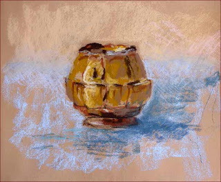
Merry Christmas! Here's a Clump o' Trees . . .

This is about 7-1/2" x 10" on very rough Saint-Armand Colours paper in a washed denim color (nice flecks in it, obviously hand mixed / hand made). I coated it with clear Colourfix primer. Then I started out with a big sloppy mess of an alcohol wash, washing in the (sort of) complementary colors to what I was intending for the finish layer.

One question is this: What's the difference among a water wash, an alcohol wash, and a wash done with Turpenoid? (And here is the answer to that question.)

Wednesday, December 24, 2008

Mr. Enormous Ear

Experiments with an alcohol wash underpainting, coloring a "print" of an old sketch, and a strange Art Deco color scheme plus eerie detached (sleeping?) floating-head subject, the later two attributes both ala Redon.

Well, c'mon. Practice is good/useful in it's own right, I suppose.

I have just received and watched the DVD Plein Air with Pastel: A Complete In-Depth Demonstration of Pastels as a Wet & Dry Medium, starring Greg Biolchini. He spends quite a bit of time and energy fiddling around with the alcohol underpainting. Interesting.

The best part of the DVD were the sounds of the birds happily singing in the forest throughout the entire demo. It took place in the woods somewhere in North Carolina and it was a lovely day. Real nostalgic for (a) North Carolina and (b) summer!!!

La Coquille Genteel?

La Coquille Odilon Redon (22-1/2" x 22-3/4")
I am not at all sure what to make of this turn-of-the-20th century French artist Odilon Redon (1840-1916). His drawings and pastels are both thoroughly creepy and quite lovely. About this particular piece, according to Roseline Bacou in Odilon Redon Pastels (1987), "The source for this well-known pastel is one of the shells which Mme. Redon, a native of the Ile-de-la-Réunion, liked to keep around her. This work, now in the Musée d'Orsay, was placed on the fireplace mantel in the Redon's living room . . . and often served as the starting point for Redon's musings." (page 178)

As I was reading that Bacou book, I turned the page to this piece and I kind of softly shouted, with surprise and then instantly with pleasure. So I had to post it. This shell, it talks.

Sunday, December 21, 2008

Determine the Extremes

The painting sequence / process, from Professor Bob Rohm:
  1. Formulate the Idea - Why am I doing this? What do I want to communicate? What's the point? Have a concept, a raison d'etre. It may change, but have one initially.
  2. Simplify the Shapes - Six to eight shapes. Lay 'em in.
  3. Average the Values - Four values. Decide and depict.
  4. Average the Colors - Each value shape becomes a color shape. Assign colors. Decide on relative temperatures.
  5. Determine the Extremes - Find the darkest dark, the lightest light, and the most dynamic edge.
Done! The rest are just modifications and refinements. Questions for the rest of the process:
-- How much detail?
-- How much information?
-- How much color variety?
NB: "Always make these modifications in relation to the extremes that you established. Nothing you add should be darker, lighter, more intense, or more dynamic than your established extremes."

[From The Painterly Approach: An Artist's Guide to Seeing, Painting, and Expressing, by Bob Rohm (2008)]

Saturday, December 20, 2008

Glove? Deprived of.


Back to drawing again! This is a page from my everyday sketchbook, done with PR Velvet Black ink and (the faces at the bottom) with Noodler's Red-Black ink in my two Lamy pens with the calligraphy nibs (one for each color!). On Strathmore Aquarius II watercolor paper, size approximately 7" x 8". I added some watercolor and some gouache (the blue!) later.

Monday, December 15, 2008

Navajo Man

This was my best drawing from the Crash Course In Drawing class this past weekend, using a grid and transferring the layout from the photo. It's overall 18" x 24". Done with charcoal, Char-Kole, and chamois, paper towels, and erasers!

The instructor, Deirdre Saunder, was great! It's a shame that she doesn't teach more classes at the Art League. I'd sign up.

Saturday, December 6, 2008

Winners in New Mexico

See the winners of the Pastel Society of New Mexico's National Show 2008, here. I especially like the work of Bill James, the winner with this, and Lelia Hall.

Friday, December 5, 2008

Jowl Study

Here is a pastel paint-by-numbers piece, using one of my carborundum prints as a base drawing.

I wanted to test some of my brand new Intense Darks II from Ludwig. The spaces on either side of her head are layered with some really interesting deep deep reds/burgundies. Very nice! 'Tho you can't see them here. Leastways I can't on my monitor.

It's about 7-1/2" x 11", on real bumpy Saint-Armand 'Colours' watercolor paper upon which I ink-jetted a blow-up of my print. I then sealed it with a coat of Colourfix Pastel Primer in clear.

Monday, December 1, 2008

Sycamore Scaffolding

These are some sycamores below my window. As the season moves on I'll see more and more of the white bleached-bone skeleton. They say the best way to learn to draw trees is by careful observation. Maybe I'll make these my special study. Since they are quite handy.

Sunday, November 23, 2008

Tan Pot

LinkThis is part of the homework for the last session of the pastels class at the Smithsonian. I tried this same ceramic pot in a number of different colors on different surfaces/backgrounds. I liked this one the best. It happens to be (a) the actual color of the pot and (b) the first one I did. Lesson: Observe closely and then savor beginner's luck.

It's about 9x12 on Daler-Rowney pastel paper (which I had bound with a spiral binding so I could use it as a sketch pad) coated with clear Colourfix Pastel Primer. I used Townsends, GAs, and Ludwigs. Mostly.

I bought three Roches the other day and for the life of me can't figure out what all the big fuss is about. The Townsends are nicer, to my mind.

Sunday, November 16, 2008

Pastels (etc!) Book List (revised 3Dec12)

Revised 3Dec12
"A" List -- Excellent books. I refer to them over and over:

  • The Pastel Book: Materials and Techniques for Today's Artist, by Bill Creevy (1991) -- This is my favorite by far. It's considerably out of date with regard to the materials (some of his delightful-looking papers don't exist anymore) but his diverse and out-there-on-the-edge techniques are all fascinating and show the versatility and vitality of the medium.
  • The Pastel Artist's Handbook: Materials, Techniques, Color and Composition, Style, Subject, by Sally Harper (2004) -- Good advice, very complete.
  • Degas Pastels, by JS Boggs and A Maheux (1992) -- Inspirational! Ed Degas is thought the modern 'master' of the medium. Good reproductions. Useful commentary on each piece.
  • Raw Color with Pastels, by Mark Leach (2006) --- Again, as with the Creevy book, examples of how far and how wide pastels can take you. Buy this one just to see the surprising images.

"B" List -- Interesting but certainly NOT necessary. The "A" List books are far better:

  • The Art of Pastel Painting, by Alan Flattmann (1987) Very dated, but still containing some good advice with regard to materials, studio organization, and techniques.
  •  Painting with Pastels: Easy Techniques to Master the Medium, by Maggie Price (2007)
  • Pastel Workbook: A Complete Course in 10 Lessons. by Jackie Simmons (2007)
  • Pastel Painting Techniques, by Guy Roddon (1987)
  • Pastel School: A Practical Guide to Painting and Drawing with Pastels, by Hazel Harrison (1996) -- Along the lines of the Harper book. Nicely illustrated.
  • Capturing Radiant Light and Color in Oils and Soft Pastels, by Susan Sarback (2007) -- This is the spiritualist/kumbaya approach to color theory. A controversial book! Suzie says stare at the shadow of a banana long enough and you can see all the colors of the rainbow. Well now. We'll have to take High Preistess Sarback's word for it!
  • All About Techniques in Pastel, by "Parramón’s Editorial Team" (English version dated 1998). Translated from the Spanish. Nicely organized. Well-illustrated.

Other EXCELLENT books of note:

  • Confident Color: An Artist's Guide to Harmony, Contrast, and Unity, by Nita Leland (2008) --- This is her new edition of the old classic Exploring Color. A very well-done and very clear guide to the skillful use of color. For those of us that came to pastels from drawing and for whom color is a dazzling wash of confusion, this books is very useful. Very comforting.
  • Mastering Composition, by Ian Roberts (2008) -- Excellent and very clear intro to composition.
  • Carlson's Guide to Landscape Painting, by John Carlson (1973) -- Totally lacking in quality reproductions and color illustrations (there is nothing reproduced in color -- not even in the chapter on 'Color' -- ha! absurd!) and totally lacking in 21st century political correctness (all artists are either "men" or "he"), it more than makes up for with excellent tips, charts, illustrations, and advice. 
  • Abstract Painting: Concepts and Techniques, by Vicky Perry (2005) -- This is an interestingly practical presentation of the tenets of the abstraction. Ignore the two chapters about oil and acrylic painting (about 20 pages).
  • Art and Fear: Observations on the Perils (and Rewards) of Artmaking, by D Bayles and T Orland (1993) -- Get past all your excuses and just get to it.

Torso in the Twigs

Here is the sketch from yesterday's Intro to Pastels class. It was a very strange day outside, up to about 74º, wet, humid, and balmy. But with very dark clouds zipping around, interrupting the sunlight. (There was a tornado warning later in the afternoon!) Anyway, we got out again to paint and this session was in the Hirshhorn's Sculpture Garden. I was attracted to this black shiny wet slick tree and wanted to connect it with that equally slick black torso on the pedestal above.

This is about 9" x 12" on Wallis Belgian Mist paper, using the usual mix of Great Americans, Townsends, and Ludwigs. I found myself really needing a shiny black pastel. Heeding all the books and all the instructors, I don't have one. So I used my charcoal pencil for the blacks. It really isn't sparkly and dense enough. Okay then! Lesson learned on stashing one pure black away in the corner of the box! And again, my Blackfoot is the bomb! Love it!

Question: is the color of the Belgian Mist paper too drab? Yesterday it kinda matched the atmosphere in the garden: drab, muted, brown, skanky . . . .

Sunday, November 9, 2008

Pug-juggly

This is one of the homework assignments from class. I have incorporated the critique suggestions from Professor Gobar, softening both the background and foreground. It looks so 3-D I can't get over it.

Saturday, November 8, 2008

Broken as Spoken


From class #4 of Intro to Pastels at the Smithsonian. Finally we had a fine day and we all went outside into the adjacent Enid Haupt Garden to draw/paint. I was using my brand new Alla Prima Blackfoot, which is small but great.

This is 8"x10", on rough Saint-Armand watercolor paper, coated with Colourfix Pastel Primer in clear. Hence the 'broken color' technique. I am happy with the Castle wall at the top and at the left and am always going to take along a small packet of pastel pencils and my beloved Pierre Noires, for this kind of line work. (Although the Nupastels would have worked just as well, I betcha.) I could probably spend some more time "refining" the lamp post and fixture as well. Hmmm.

Next experiment: Lay on a base pastel color on the rough paper, rub it into the grain, then apply 'broken' color on top. Use two colors that are the same value.

Wednesday, November 5, 2008

Making History

"Rosa sat so Martin could walk. Martin walked so Barack could run. Barack is running so our children can fly."

Addendum Day Two: "It felt like Berlin after the Wall was breached. Something that had been imagined for so long, yet seemed impossible, just . . . happened. It felt like the American promise, fulfilled. At the foot of the Key Bridge just after midnight, hundreds of Georgetown University students poured off the campus. "White House!" they shouted to one another, and off they ran, along M Street NW, down Pennsylvania Avenue, picking up pretty much the entire student body of George Washington University on their way." the beginning of Marc Fisher column, usually our daily dose of glum pessimism, in today's Post.

Monday, November 3, 2008

Emperor in the Basement

Week 3 of our Intro to Pastels class at the Smithsonian. The weather was less than ideal so we stayed in yet again and painted from photos brought by Michelle, the TA. I was lucky enough to find this cool pic of a Roman sculpted face. Very interestingly lit and nicely cropped. I should have used the orange-tinted paper, instead of the blue. What a waste of a good opportunity. Next time! And neither the right nor left sides are entirely "resolved" but oh well. I was afraid that further fiddling wouldn't help. (How do you know when a thing is finished? You just know.)

Sunday, October 19, 2008

Visual Warm-Up Exercises


From the 1st day of class of Introduction to Pastel, taught by Sandra Warren Gobar, an ingenious stepped warm-up exercise, which can be done all on one sketchbook page (9x12) as shown:
  1. first, walk around the area (if plein air), your scene, or around the still life set-up and find your view, the view that you want to engage; situate yourself in front of that view.
  2. do a preliminary 1-minute warm up sketch
  3. next do a 40-second two-step (look up and look down) contour drawing
  4. now a 10-second gesture drawing
  5. then do a 30-second blind contour drawing
  6. finally, do a 1-minute warm up sketch
The theory behind all this is that, in the first minute you initially engage and explore, without being allowed to get too anal. During the first contour you find the lines. The gesture finds the movement. The blind contour forces you to look more carefully. And the last sketch is the one with the most "visual information". Is it your final composition? I dunno. But putting all these on the same sketchbook page is very handy. You can actually see your thoughts. Very revealing and instructional.

ADDENDUM: Possible plein air locations, in DC:

Friday, October 10, 2008

Jugglery joculari


ScumbleWorld! This is Arches 300lb 'Rough' paper, coated with clear Colourfix Primer, so it's like painting on aggregate concrete. I could have added quite a few more layers with no problem at all. That squatty foreground jug is a shape that I keep coming back to time and time again, even though I don't have anything in my real universe that is that shape. It lives a very chunky and substantive life in my imagination, however. It's a standard doodle shape for me.

PS: 8 hours + 17 minutes until Hockey Season!

Saturday, October 4, 2008

Pauvre Mauve Pears

This began as a sort of tea-stained board. The pear color is the 'compliment' of that tea-colored surface. Blue-violet being the compliment of the drab ochre. Palette below. The four there in a row that all look black are actually various tints of a wonderful deep deep Terry Ludwig aubergine (technically a "violet"). Neat color!

Inspirational pears here.

Sunday, September 28, 2008

Cautionary Pears

One of the key elements in these exercises is knowing when to stop. Clearly an element that has yet to sink in with me. As you can see, the shadow is particularly worked nearly to death. Practice! Practice! This is about 8"x10" on Canson Mi-Teinte blue paper. I like the look of the bare paper edge when I take the masking tape off. It somehow brings the whole thing back to a baseline of some kind. It would work even better if some of the blue paper were peeping through. Better on rougher paper.

I am eager to try out the clear Colourfix Primer on the colored St. Armand very rough watercolor paper. Will it let the color of the paper shine through? Will it do so with the addition of some more pumice? With some carborundum? The "support" prep part is really fun for me too. Why is that?


Monday, September 22, 2008

Abstraction? Okay, done!

These are my two Mark Leach Raw Colours with Pastels knock-offs. (See pages 64 and 65.) Somehow mine aren't quite as raw as his.

Sunday, September 21, 2008

Scumble Bunny

The support for this is a very rough watercolor board that I prepared with a mixture of white Colourfix Primer mixed with some 100 grit carborundum. It was so rough that it ate pastel like Godzilla! It was great! (I have some finer carborundum which I will try as well.) You can see the grayish flecks of carborundum on the paper, which might be mitigated with some tinting of the primer.

As for layering and scumbling, this surface was the greatest. I could have put many more layers on it. Great fun! I can scumble like Creevy.

(Could the word 'scumble' be related to the word 'scumber"? It's certainly not far fetched. They probably come from the same root.)

Tuesday, September 16, 2008

Can these pears be saved!?

This is 7"x10" on very rough watercolor paper that I coated with white 'Fine Tooth Colourfix Primer' and then toned with deeply pigmented watercolor. I put red under the green pears and green under the reddish background. I got so much into the layering that I ended up nearly smearing. I had to spray it with workable fixative often. The 'tooth' of the primer isn't as good as the that of the sandy papers. Maybe I will add more grit to the primer and see what that does.

Sunday, September 14, 2008

By George . . . . !

. . . . I think I may be getting it. This is 6" x 9", done on Wallis "Belgian Mist" paper, with Nupastels. This whole layering thing is very riveting. Also Belgium is a great place. So the paper is definitely helping.

Saturday, September 13, 2008

The Learning Curve is steep indeed

The pastels learning curve is taking me for a ride. Pears rulz. I suppose.

Below is a page from the everyday sketchbook. Gouache+pen+ink+watercolors on darker colored paper. Quebeçiose St. Armand 'coloured' paper rulz. Although those pink legs look a tad skanky.

Q: How many days until the beginning of hockey season?
A:
27 days, or 653 hours, or 39,234 minutes, or 2,354,063 seconds
Addendum: SOON!

Tuesday, September 2, 2008

Homestead Farms Field Trip


This is one of the barn complexes at Homestead Farms, along with one of their dragon flies.

Monday, September 1, 2008

Figure Class - done - for now


The Figure Class at the Art League is finished. I did detect some improvement in my work, albeit not record-shattering in speed or in impact. I am going to see about regular open figure sessions elsewhere here in town.

According to the Post, that Figure Models Guild of Washington DC is a very talented pool of models here in the Metro region. With such a resource at our fingertips, who can resist?

Friday, August 29, 2008

Polkadot Wednesday


Metro sketching benefiting a bit from the figure drawing class. Look and look and concentrate. In the upper right I am experimenting with diluting pastels with watercolors. I am trying to start a Color Journal but keep getting sidetracked. Soon!

Saturday, August 9, 2008

Bruised Pear

Old, tired pear with bruise front n' center.

Friday, August 8, 2008

Pear Plan

Day One? K! Day Two? Dunno!

Monday, August 4, 2008

Monacacy Encampment

I stopped at Monocacy National Battlefield on the way home from Libertytown yesterday and discovered an 'Encampment' event being held on the grounds of the Gambrill Mill section, which is my favorite part of the battlefield. There was a group of Confederate re-enactors and a group of Yankee re-enactors. The Yankee group did a nice artillery demonstration. There were only six of them, but it wasn't hard to imagine that same sound, but coming from a thousand guns. Pretty scary.

I was sketching this view of the Confederate tents (they had slept in them the night before) when four of them came over to chat. To see what I was doing. And then one of them showed me his sketchbook! He had been working in it for years! It was chock full of delightful pen and ink drawings done with an historically accurate steel nib! (I should have asked him about his ink.)

His drawings recorded encampments and re-enactments that he had participated in. It was meant to be like the sketchbooks Civl War soldiers and their contemporary newspaper illustrators kept during the War. The other three guys looking over my shoulder pointed out buddies and relatives and recognized events they had attended from these drawings. This is testimony to how well the artist had captured likenesses! These were great drawings, very delicate and precise, and I urged him to take very good care of them! He just shrugged.


Anyway, these Confederate fellows were telling me about some of the odd questions that they get from onlookers during these kinds of re-enactments and encampments. I wrote some of the good ones down. These were NOT questions from children either:
-- How come all the battles were fought on National Park Service land?
-- Were all these monuments here during the battle? Is that how the troops knew where to go?
-- (and my favorite) Is that real fire?
-- (and the one I asked yesterday) So, who won?

Later in that same general area I got out my new sketch box and set it up to paint a small view of the edge of a pond and a path leading off into the dark woods. I learned a bit about the logistics of the set up and the limitations of the watercolors. (Gouache or the pastels will be much more fun!) As well as the odds of attracting folks who want to look and chat. I suspect that the sketch box all set up is a magnet. I actually enjoy this chatting part. Especially when they have to come some distance off the 'beaten path' to get close enough to talk. You do meet some nice folks! Which I did yesterday.

On the way home from there I stopped at Homestead Farm, just a bit south of Poolesville. I got the most beautiful peaches and blackberries. There were folks emerging from the orchard area with wheelbarrows full of peaches! Who were they? What on earth do you do with thirty pounds of peaches? Cobbler for a hundred!

Friday, August 1, 2008

Summer Slump


The Arf Arf Days of summer are in full swing. Note to Tourists: Stopping at the top of a moving escalator on Metro is generally not practical. You could get trampled!

Q: How many days until the beginning of hockey season?
A: 70 days and 1,686 hours.
Addendum: [sigh]

My Figure Drawing Class is going well, despite my sloth. I really enjoy drawing 'from the figure' and may sign up for open figure drawing sessions. Someday.

My experiments with pastels are going very slowly. The noteworthy mess that the whole enterprise makes is daunting. Despite that, I have a plan predicated on my friend Samter Petuel's stellar+inspirational example: a Pear A Day, with these variations:
  • different color schemes (analogous, complimentary, split complimentary, complimentary with the "discord"
  • different lighting effects, different directions
  • different points of view, such as straight on and from above
  • different kinds of strokes - cross-hatched, scribbled circles. layers, layers with intervening fixative
  • different surfaces
  • different colored surfaces
  • different kinds of pastels, hard, soft, pencils
The theory and framework are there. Where is the get-up-and-go? We'll see.

Monday, July 21, 2008

Watch my Dust!


I have been lately playing around with pastels --> literally solid sticks of (almost) pure pigment. I have rarely encountered a messier medium! You just have to pick one of these little pastels up and you are all blue -- or red or magenta or green -- all over. But the colors are really lush and the mark is nice and sketchy, if I can stop myself from blending, blending, and over-bending. I have a miscellaneous set of various very soft pastels and a full set of hard pastels. I like the soft pastels for the lushness and goopiness of the mark and the brilliancy of the color. But I like the hard pastels for the control. I took a few of the hard pastels out with me to the Palisades Farmers' Market on Sunday morning and sketched some fruit with them. I didn't really give them a good try because of the gnats. (Note to self: put insect repellent on, even if you're in town!)

The sequence for value is dark-to-light, for the most part, as it is with gouache. But not so strict. Another variable is paper! Paper color is one choice and another is paper texture. The hue and value of the underlying color seems to be a key element in pastels (as it is in gouache!) and the texture of the paper coating has to do with how many layers of color you are able to lay down. The coated papers are like very fine sandpaper and they accept a lot of layers. And you can buy light colored coated paper and color it yourself, any color (or combination of colors) you want, with watercolor or acrylic washes.

So much new stuff to try and so many variables. And sooooo much more money to spend!

Sunday, July 13, 2008

Figure Class

Yesterday was the first session of my 7-week Figure Drawing in Varied Media class at the Art League. It's three hours every Saturday morning, led by Priscilla Treacy. It's a fairly large class, as these classes go, so I'm not sure how much individualized attention each of us will get. But oh well, I'll make sure that it will be fun.

What luxury to:
-- Have a model that will hold still! So much better than my usual "models" on Metro.
-- Get all messy with charcoal! This stuff called Char-Kole is the greatest! As black and as heavy and as creamy as you could ask. Neat stuff. (I definitely need to bring hand wipes next week.)

Eventually we are going to paint on paper with a technique called "peinture a l'essence" (used by Toulouse-Lautrec and Eddie Degas), which appears to be regular oil paint that has had the oil leached out of it by letting it sit on absorbent paper for a while. We'll use turpentine to dilute and apply it. It sounds stinky and awful to me and I wonder, if the 'requirement' is that we have to use paper as the support in this class, why we don't just use gouache. No muss no fuss. No turpentine! Maybe I'll be a pest and ask her.

Saturday, June 28, 2008

White Cap Crowd

Some folks on Metro last week. The tan paper on the left is the BFK again. I am obviously into those white gouache highlights. This is a page and a half scanned from my small everyday sketchbook.

The little blue sliver on the left is a page of Québécois St. Armand paper, which was part of a sample pack that I found in New Mexico. I chopped it up and put pages into the sketchbooks here and there. Nice to have different textures and colors to mess around with.

Tuesday, June 24, 2008

Pinch


Fingers portrait and why not? Done with ink, watercolor, white gouache, and then finally some smudged Pierre Noire, on tan BFK Rives paper. The "negative space" is kind of a smile, isn't it? Hadn't noticed that.

BFK, by the way, stands for
Blanchet Frères et Kleber, the original manufacturers of the 'Rives' paper, at a mill in Rives near Grenoble, France.

Speaking of France, I have been studying (not reading, but actually studying) the old and respected book about Cézanne by Erle Loran, an art professor at UC Berkeley, entitled
Cézanne's Composition: Analysis of His Form with Diagrams and Photographs of His Motifs. It was written in 1963 and lately re-printed.

The term 'motifs' in the title refer to photos of the actual places and scenes in France that
Cézanne used as subjects. One of Professor Loran's excellent analytic diagrams is reproduced below, from page 77. (It's his diagram of La table de cuisine, now at the Musée d'Orsay.)


I have learned two new and interesting things from the book so far. First, that Professor Loran is convinced that Cézanne himself did NOT construct his compositions using the same kind of analysis or forward planning that the professor uncovers. He goes to great lengths in the introductory material to 'prove' that Cézanne had no systematic/academic understanding of the theoretical underpinnings of composition.

It was all pure instinct, according to the fine professor.

And second, for
Cézanne, the choice of initial subject matter had little to do with the success of the painting, as measured by Professor Loran's analyses. So really, all the parts in the book that are devoted to discussion of the original 'motifs' are pretty moot, in my opinion. Cézanne wantonly re-arranged what he saw in front of him to meet the needs of his picture. He made a timeless masterpiece out of a picture of some old rocks in a quarry.

What this also says to me is that you need not and ought not to wait for your surroundings to provide you with exciting or inspiring subject matter. You can learn and grow and get satisfaction and enjoy the heck outta just drawing a door handle or a chair leg.

And so there it is.

Sunday, June 22, 2008

Sketchcrawl, Saturday June 21st

Sketchcrawl June 2008! Once again, I am the only one to show up. But it's still fun. Above, on the right of the sketchbook page, is the view along the north side of the golden NMAI, with pinky-gray Air+Space in the background (with the top of Ad Astra, which means 'To The Stars', that spiky sculpture by Richard Lippold in front of Air+Space, popping up above the trees), as well as ye ole Washington Monument.

On the left side of the page is an experiment: sketching a face with just a dark watercolor tone. No detail, no line. A few more wc sketches are below. (Here is another one.)

Speaking of NMAI's Mitsitam Cafe, is it my imagination or is it getting even more expensive? A simple lunch of roasted salmon with two sides, and a Key Lime tart (excellent!) cost just shy of thirty bucks. Oh, wait. I guess it was that cup of coffee that almost put me over the top. Hmmm!


Sunday, June 15, 2008

Gouache for Field Studies

I enjoyed my weekend workshop at the Art League with Diane Tesler entitled Gouache for Field Studies & More. We spent all of the second day outside, painting scenes in Old Town. There were a few demos at the beginning, but we were pretty much on our own, with a little bit of individual critique, when and if Diane could catch up with us. It was very instructive just to get down to it and mess around.

One of the elements that she emphasized was to begin with strongly tinted paper. Depending on the scene you intend to paint, tint with a warm or cool acrylic wash. The watered-down liquid acrylic wash also seals the charcoal underdrawing, which is very handy. (But I'm not sure I am willing to give up that pristine white page! I suppose when one of your colors is white, it isn't that critical. I have put some BFK Rives tan colored paper in my everyday sketchbook, to test it with watercolor. If it works well I might add that white gouache to my palette.)

Once again, there were some very nice folks in the workshop. As always at the Art League. One of them is going to Provence with Susan Abbott in a few weeks. ENVY!!

I spent some considerable time on the painting above. Really messed around with it. The one below was a very quick sketch with minimal prep. Gouache worked well for both of them. I think.


Thursday, June 12, 2008

Pierre Noire

Here is an experiment with Conté à Paris Pierre Noire charcoal pencil and watercolor. The charcoal is dark as the darkest night and smears really nicely. More experiments to come!

I have enrolled in a two-day workshop on gouache this weekend. I am worried because the techniques used for gouache are diametrically opposed to all those used in watercolor. In common with oil painting, with gouache you apply the paint dark to light. Where in wc, you do the opposite.
As per MacEvoy: We get a hint of what's involved in the use of gouache (pronounced "gwash") by considering the origins of the name: it comes from the Italian aguazzo, for "mud." I may be hopelessly muddled/muddied by Sunday afternoon.

Thursday, June 5, 2008

Corkscrew

I don't know why. Why not?